ggplot2
基本的な使い方
使い方の例
set.seed(7)
data_df <-
  data.frame( var1 = 1:10,
              var2 = rnorm(10),
              var3 = rep(LETTERS[1:3], length.out = 10))

ggplot(data = data_df) +
  geom_point(aes(x = var1, y = var2, color = var3)) +
  geom_line(aes(x = var1, y = var2, color = var3))
ggplot() 関数で ggplot オブジェクトを作成し、その ggplot オブジェクトに対して、 + 演算子を使って作図したいグラフの種類(geom_*() 関数)を指定する。 geom_*() 関数の中で aes() 関数を使って作図に使用する変数を指定する。
ggplot()
ggplot(data = NULL, mapping = aes(), ...)
data: プロットしたいデータを含むデータフレームを渡す。データフレームは tidydata の形式になっていることが想定されている。mapping: 作図に使用する列名をaes()関数を介して指定する。 例 :aes(x = longitude, y = latitude, color = height, fill = height)
geom_*()
グラフの種類ごとに geom_*() 関数が存在する
ちなみに geom は geometry (ジオメトリ)の略、グラフの基礎となる構造を指定する
geom_line()
geom_point()
aes()
aes() 関数は、 ggplot() や geom_*() の中で使う。具体的には aes() の出力を ggplot() や geom_*() の mapping 引数に渡す。基本的には geom_*() 関数の中で使うのが一般的。
aes() 関数は、散布図や折れ線などのグラフの座標(x, y)や線の色(color)、塗りつぶしの色(fill)、サイズ (size) などに 「使用する列」 を指定する。
ちなみに aes は aesthetic(エステティック) の略、軸や色の指定に使用する変数を指定する
# 都市の位置( longitude, latitude)に点をプロット
# 都市名 (city) で色分け
# 点のサイズは人口 (population) に比例

data(data_df) +
 geom_point(aes(x = longitude, y = latitude, color = city, size = population))
データのグループ分け
例えば、 geom_path() などでグループごとに別々の線を書きたい場合などに使う
aes(x = X, y = Y, group = A)  # 変数Aの値を使ってグループ分け
aes(x = X, y = Y, group = interaction(A , B)) # 複数変数を使う場合
グラフの種類: geom_*()
geom は geometry (ジオメトリ)の略、グラフの基礎となる構造を指定する
散布図
geom_point(aes(x, y))
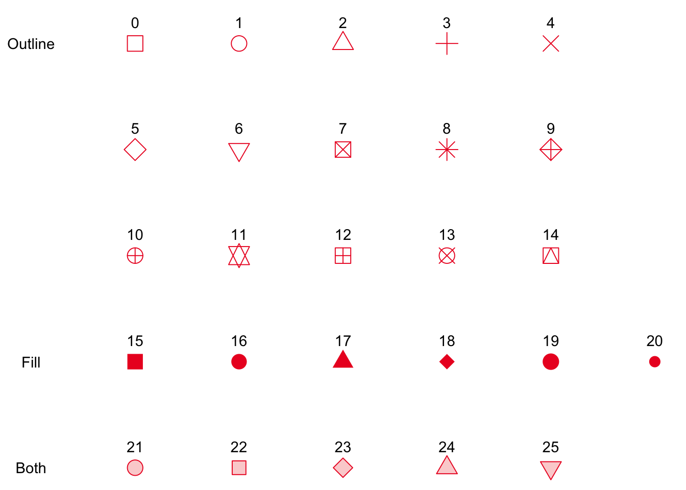
点の種類
shape
-
color = 外部色 フチなし
-
1 丸, color 色指定 外部が塗りつぶされる
-
color = 縁の色 縁あり
-
19
geom_point(aes(fill=id, size=id), colour=“black”, shape=21, stroke = 2)
折れ線・経路
geom_line(aes(x, y))
geom_path(aes(x, y))
geom_line() や geom_path() で x 軸に指定した変数が factor の場合は aes(group=1) を指定する。
ヒストグラム・密度分布
連続変数 x の値のビンごとの度数、頻度を、棒グラフ、曲線、折線で描画する
geom_histogram() # 棒グラフ(デフォルトは頻度分布)
geom_density()   # なめらかな曲線(デフォルトは密度文王)
geom_freqpoly()  # 折線(デフォルトは頻度)
頻度分布と密度分布の切り替え
いずれの geom_* でも、aes() の中で y を指定することで縦軸をカウント ..count.. 、密度(%) ..density.. のどちらにも対応できる
geom_histogram(aes(x, y = ..density..))
geom_density(  aes(x, y = ..count..  ))
色分けした変数の位置
position = "identity" # 重ね描き
position = "stack"    # 積み上げ
position = "dodge"`   # 隣接
position = "fill"     # 割合
ビンの切り方: stat_bin()
stat_bin() の binwidth から下の引数は geom_*() の中でも指定できる。
つまり、次の2つの書き方は等価
geom_histgram(aes(x), binwidth = 0.1)
geom_histgram(aes(x)) + stat_bin(binwidth = 0.1)
stat_bin(
  mapping = NULL,
  data = NULL,
  geom = "bar",
  position = "stack",
  ...,
  binwidth = NULL, # ビン幅
  bins = NULL,     # ビン数
  center = NULL,
  boundary = NULL,
  breaks = NULL,   # ビンの切れ目
  closed = c("right", "left"),
  pad = FALSE,
  na.rm = FALSE,
  orientation = NA,
  show.legend = NA,
  inherit.aes = TRUE
)
x が離散変数なら stat_count() の方がいい
連続変数の離散化
# 変数 x を10個の等間隔のbinに切る
cut_interval(x, 10)
棒グラフ
1変数(カテゴリ変数)だけ指定すると、指定されたカテゴリ変数の値の数をそれぞれカウントした値が Y 軸になる。stat = "count" がデフォルトなので、暗黙に stat_count() が使用される。
ggplot(df) +
geom_bar(aes(x = category))
# 以下は上と同義
#geom_bar(aes(x = category), stat = "count")
X 軸(カテゴリ変数)と Y 軸(量的変数)の値を別々に指定する場合 stat = "identity"
ggplot(df) +
geom_bar(aes(x = category, y = value), stat = "identity")
stat = "identity" は geom_bar(aes(x = category, y = value)) + stat_identity() と同じ意味になる?
棒の間に隙間を開けない時は width = 1
geom_bar(aes(x = category), width = 1)
積み上げ棒グラフ
X 軸(カテゴリ変数)と Y 軸(量的変数)のほかに、変数Z(カテゴリ変数)で色分けした積み上げ棒グラフ aes(fill = z)
ggplot(df) +
geom_bar(aes(x = category, y = value, fill = category2), stat = "identity")
積み上げ棒グラフの縦軸を割合にする position = "fill"
ggplot(df) +
geom_bar(aes(x = category, y = value, fill = category2), stat = "identity", position = "fill") +
scale_y_continuous(labels = percent)
棒の順序を変える
数が多い順に棒を並べ替えるなど。基本的には、予め、x軸(カテゴリ)ごとのy軸の値(カウントなど)を計算しておく必要がある。つまり、 stat = "identity" を指定するやり方が前提。
変数 y 軸の値を使って x 軸の順番を並べ替える。
# 昇順の場合
ggplot(df, aes(x=reorder(x, y), y=y), stat = "identity")

# 降順の場合
ggplot(df, aes(x=reorder(x, desc(y)), y=y), stat = "identity")
reorder(x, y) は基本的に relevel() の特殊なバージョン、つまり、変数 x を factor に変換し、その level の順序を 変数 y の値に戻づいて設定する。
棒の向きを水平にする
横向きの棒グラフを作成するには最後に coord_flip() を付け加えるだけ
ggplot(df) +
geom_bar(aes(x = category, y = value, fill = category2), stat = "identity") +
coord_flip()
箱ひげ図・バイオリンプロット
geom_violin(
  mapping = NULL,
  data = NULL,
  stat = "ydensity",
  position = "dodge",
  ...,
  draw_quantiles = NULL,
  trim = TRUE,
  scale = "area",
  na.rm = FALSE,
  orientation = NA,
  show.legend = NA,
  inherit.aes = TRUE
)
線分
# 垂直線
geom_vline(xintercept = 10)
# 水平線
geom_hline(yintercept = 110)
# 傾いた線
geom_abline(intercept = 37, slope = -5)+
linetype=“dashed”
テキストラベル
# 文字列
geom_text()
# Boxで囲まれた文字列
geom_label()

# 同じ
annotate("text", x = bbox["xmin"], y = bbox["ymax"], label = "hoge", vjust=1, hjust=1)
annotate("label", x = bbox["xmin"], y = bbox["ymax"], label = "hoge, vjust=1, hjust=1)
p <- ggplot(mtcars, aes(x = wt, y = mpg)) + geom_point()
p + annotate("text", x = 4, y = 25, label = "Some text")
p + annotate("text", x = 2:5, y = 25, label = "Some text")
p + annotate("rect", xmin = 3, xmax = 4.2, ymin = 12, ymax = 21,
  alpha = .2)
p + annotate("segment", x = 2.5, xend = 4, y = 15, yend = 25,
  colour = "blue")
p + annotate("pointrange", x = 3.5, y = 20, ymin = 12, ymax = 28,
  colour = "red", size = 1.5)

p + annotate("text", x = 2:3, y = 20:21, label = c("my label", "label 2"))

p + annotate("text", x = 4, y = 25, label = "italic(R) ^ 2 == 0.75",
  parse = TRUE)
p + annotate("text", x = 4, y = 25,
  label = "paste(italic(R) ^ 2, \" = .75\")", parse = TRUE)
点の形
geom_point() の shape 引数に数値を指定することで点の形を指定する
色の指定
色分けに使用する変数は aes() の中で aes(color = var1, fill = var2) のように指定する。
color (線や点の色)に対しては scale_color_gradient()
fill (塗りつぶし色)に対しては scale_fill_gradient()
をそれぞれ使用する。
色もある種の軸であるので scale_x_continuous() と同様に scale_color_continuous() や scale_fill_continuous() のように scale_*_()関数の一種として扱われている。
色の種類
連続値に対する色つけ : scale_*_gradient
連続値: integer, numeric
integer は factor にしないと離散値とはみなされない
scale_colour_gradient(..., low = "#132B43", high = "#56B1F7",
  space = "Lab", na.value = "grey50", guide = "colourbar",
  aesthetics = "colour")

scale_fill_gradient(..., low = "#132B43", high = "#56B1F7",
  space = "Lab", na.value = "grey50", guide = "colourbar",
  aesthetics = "fill")

scale_colour_gradient2(..., low = muted("red"), mid = "white",
  high = muted("blue"), midpoint = 0, space = "Lab",
  na.value = "grey50", guide = "colourbar", aesthetics = "colour")

scale_fill_gradient2(..., low = muted("red"), mid = "white",
  high = muted("blue"), midpoint = 0, space = "Lab",
  na.value = "grey50", guide = "colourbar", aesthetics = "fill")

scale_colour_gradientn(..., colours, values = NULL, space = "Lab",
  na.value = "grey50", guide = "colourbar", aesthetics = "colour",
  colors)

scale_fill_gradientn(..., colours, values = NULL, space = "Lab",
  na.value = "grey50", guide = "colourbar", aesthetics = "fill",
  colors)
離散値に対する色つけ
離散値: character, factor
integer は factor にしないと離散値とはみなされない
レイヤーごとに異なる色の軸を指定する
ggnewscale::new_scale("color")
ggnewscale::new_scale("fill")
ggnewscale::new_scale_color()
ggnewscale::new_scale_fill()
new_scale(new_aes)
new_scale_colour()
タイトル
labs(
  title = waiver(),    # タイトル
  subtitle = waiver(), # サブタイトル
  caption = waiver(),  # キャプション、右下
  tag = waiver()       # タグ、上左
)
タイトルとサブタイトル
ggtitle(label, subtitle = waiver())
軸のスケールや目盛の設定: scale_*()
軸に対する様々な設定は scale_軸_データ型() 関数により行う。
- 軸の種類:
x,y,color,fill,alpha,size,linetype,radius,shape - 軸のデータ型:
condinuous,descrete,date,datetime,binned
scale_軸_データ型()
scale_[x,y,color,fill]_[condinuous,descrete,date](
  breaks=c(1,2,3,4), # 目盛位置
  labels = c("01","02", "03","04"), # 目盛に表示する値のラベル
  limits=c(0,120),   # 表示する値の範囲
  # 表示する値の範囲を絞った時に、範囲外の値をどのように表示するか
  # oob = scales::censor, # NAに置換する
  # oob = scales::squish, # 範囲外の値に変換する
  # oob = scales::squish_infinite, # 無限値を範囲外の値に変換する
  oob = scales::censor(),
  trans = "log10",   # 軸のスケールを変換する関数
  name = "X axis",   # 軸の名前
  guide = guide_axis(n.dodge = 2), # 目盛のラベルが重なっているときに位置をずらす
  expand = c(0,0) # x軸, y軸に対して、上下の隙間の大きさ、c(0,0)は隙間なし
)
軸の名前
X軸ラベル、Y軸ラベル
xlab(label)
ylab(label)
2軸グラフ
# Value used to transform the data
coeff <- 30

ggplot(count_df, aes(x=date)) +

  geom_line( aes(y=n_vessel), color = "red") +
  geom_line( aes(y=n_data / coeff), color="blue") + # Divide by 10 to get the same range than the temperature

  scale_y_continuous(

    # Features of the first axis
    name = "First Axis",

    # Add a second axis and specify its features
    sec.axis = sec_axis(~.*coeff, name="Second Axis")
  )
凡例
凡例を消す
特定の凡例(colour)を消す1
guides(colour=FALSE)
特定の凡例(colour)を消す2
scale_colour_discrete(guide=FALSE)
全ての凡例を消す
theme(legend.position = 'none')
凡例のタイトルを消す
theme(legend.title = element_blank())
凡例の位置
# テキストで位置を指定
# "none"、"left"、"right"、"bottom"、"top"
theme(legend.position="right") # 右

# 数値ベクトルc(x,y)で位置を指定
theme(legend.position=c(0,0)) # 左下
theme(legend.position=c(1,1)) # 右上
theme(legend.position=c(0.5,0.5)) # 中央
凡例の点のサイズ変更
デフォルトでは geom_*() で指定したサイズで凡例の点も表示されるが、点が小さい時には困る。凡例だけで大きいサイズでプロットしたい場合。
ggplot()+

  # guides() 関数の中で指定する場合
  guides()(color = guide_legend(override.aes = list(size = 5)))+

  # scale_*() 関数の中で指定する場合
  scale_fill_manual(
    values = c(
      "A" = "blue",
      "B" = "cyan",
      "C" = "yellow"
    ),
    guide = guide_legend(override.aes = list(size = 5))
  )
凡例の名前(変数名)を変更する
labs(shape="Male/Female", colour="Male/Female")
画像として保存する : ggsave()
gsave(
    filename,
    plot = last_plot(),
    device = NULL,
    path = NULL,
    scale = 1,
    width = NA,
    height = NA,
    units = c("in", "cm", "mm"),
    dpi = 300,
    limitsize = TRUE,
     ...)
filename: ファイル名、拡張子で出力形式は自動で判別されるplot: ggplotオブジェクト、デフォルトでは最後にプロットしたものが使われるdevice: 出力形式:“eps”, “ps”, “tex” (pictex), “pdf”, “jpeg”, “tiff”, “png”, “bmp”, “svg” or “wmf” (windows only)path: 保存先のパス filename と合体するscale: 指定した出力サイズを scale 倍するwidth: 幅height: 高さunits: 幅と高さの単位 (“in”, “cm”, “mm”)dpi: ラスター画像の解像度 dot per inch、文字列でも指定できる “retina” (320), “print” (300), or “screen” (72)limitsize: TRUE だと 50x50インチより大きいサイズでプロットしない、エラーを防ぐため
テーマ
テーマの要素の色を変える
詳しくはこちら
https://www.rdocumentation.org/packages/ggplot2/versions/3.3.2/topics/theme
color <- "black"

  theme(#rect = element_rect(colour = color, fill = color),
        #text = element_text(color = "white"),

        # プロット領域の背景
        plot.background = element_rect(colour = color, fill = color),

        # パネル全体の背景
        panel.background = element_rect(colour = color, fill = color),

        #legend.key = element_rect(colour = color, fill = color),
        #panel.border = element_rect(fill = NA, colour = "white", size = 1),
        #panel.grid.major = element_line(colour = "grey60"),
        #panel.grid.minor = element_line(colour = "grey30"),

        #axis.text = element_text(colour = "white"),
  )+
複数のプロットを1つをまとめる
patchwork パッケージを使うのが楽ちん
https://qiita.com/nozma/items/4512623bea296ccb74ba
基本的には + 演算子で複数の ggplot オブジェクトを1つにまとめる
library(ggplot2)
library(patchwork)

p1 <- ggplot(mtcars) + geom_point(aes(mpg, disp))
p2 <- ggplot(mtcars) + geom_boxplot(aes(gear, disp, group = gear))
p1 + p2
p1 + p2 は p1 と p2 を左右に並べる
p1 と p2 を縦方向に並べるときは plot_layout(ncol = 1) を加える
p1 + p2 + plot_layout(ncol = 1, heights = c(3, 1))
間隔を開けたいときは plot_spacer()
p1 + plot_spacer() + p2
複雑な構造を指定するときは {} を使用する
# p1 は左、p2は右上、p3は右下
p1 + {p2 + p3 + plot_layout(ncol = 1)}
図全体のタイトルや、サブ図ごとの図表番号などの指定
p1 + p2 +

plot_annotation(
    title = "Title",
    subtitle = "Subtitle",
    caption = "Caption",
    tag_levels = "A",
    tag_prefix = "fig ",
    tag_suffix = ":"
  )
凡例が共通の時は1つにまとめることができる。
p1 + p2 + plot_layout(guides = "collect") &
# さらに凡例の位置を下にする
  theme(legend.position='bottom')
特定の変数の値を使って図を分離する
facet_grid() や facet_wrap() を使う
facet_grid() は図を2次元に配置する
ggplot(diamonds, aes(x=carat, y=price)) +
  geom_point(aes(colour=clarity)) +
  facet_grid(. ~ color)   # Horizontal 横に並べる
  #facet_grid(color ~ .)  # Vertical 縦に並べる
テキストボックスを追加する
ggtext パッケージを使うのが楽
library(ggtext)

gglot()+
  geom_textbox(aes(x, y, label, ))
引数
- nudge_x, nudge_y ボックスの位置座標からのオフセット
- box.padding : 長さ4のベクトル、ボックス外の余白を指定 grid::unit(c(1,1,1,1), “cm”))
- box.margin : 長さ4のベクトル、ボックス外の余白を指定
- box.r : 長さ1のベクトル、ボックスの角の丸みを指定 grid::unit(c(1), “cm”))
- width, height : 長さ1のベクトル、ボックスの幅と高さを指定 grid::unit(c(1), “cm”))
- minwidth, maxwidth: ボックスの幅の最小最大値
- minheight, maxheight: ボックスの高さの最小最大値
aes()
- x : ボックス位置のx座標
- y : ボックス位置のy座標
- label : テキスト
- colour : テキストとボックスの縁線の色
- box.colour : ボックスの縁線の色
- box.size : ボックスの縁線の太さ
- fill : ボックスの色
- alpha : 透明度
- halign ボックス外のテキストの水平位置 0なら左寄せ、1なら右寄せ
- valign ボックス外のテキストの垂直位置 0なら下寄せ、1なら上寄せ
- orientation : テキストの向き “upright”, “left-rotated”, “right-rotated”, “inverted”.
- hjust : 0ならボックスの左端を座標に合わせる、1なら右端を座標に合わせる
- vjust : 0ならボックスの下端を座標に合わせる、1なら上端を座標に合わせる
- text.colour : テキストの色
- size : フォントサイズ
- family : フォント
- fontface : bold italic
- lineheight : ?
- group : ?

